Introduction
This is Part III of a series exploring the Law Enforcement Officer Diversity dataset released by the NJ OAG.
- In Part I, we looked at municipal police departments and observed that towns on the Jersey Shore – especially smaller towns – had larger police departments relative to population than the rest of the state.
- In Part II, we started gathering data from other sources to create a combined table of municipal PDs, including use of force data from the njoaguof package, plus population, density, income and race and ethinicity data from the US Census. We concluded by observing that agency size is a better predictor than population for use of force incidents.
In this post, we will look at what factors affect the number of use of of force incidents per officer. In particular, we want to know:
Is there a relationship between law enforcement officer diversity and the per-officer use of force rate?
Taken at face value, the answer to this question is yes. For example, across municipal agencies, the 2021 per-officer use-of-force rate \(F\) is positively correlated with \(r_\text{officer black}\), the proportion of officers that are Black (\(p=.026\)). On the other hand, the use of force rate is also positively correlated with \(r_\text{black}\), the proportion of residents that are Black (\(p=7 \times 10^{-6}\)). Of course, \(F\), \(r_\text{black}\) and \(r_\text{officer black}\) are all mutually correlated, and in a joint linear model, \(r_\text{black}\) is positively correlated with \(F\) while \(r_\text{officer black}\) is negatively correlated with the use of force rate.
So, refining the question a bit, we want to ask:
Across municipal police departments, after accounting for municipal data, is there a relationship between law enforcement officer diversity and the per-officer use of force rate?
The perhaps somewhat surprising answer is, for the most part, no. More precisely, we find that, after accounting for municipal household median income, racial demographics, and a regional factor (North Jersey vs South Jersey), there is no significant correlation between the 2021 per-officer rate of use of force on the one hand and officer median age, officer gender ratio, and the ratio of white, Black or Hispanic officers on the other. It is possible that there is a relationship between the ratio of Asian officers and the use of force rate, but the evidence is weak.
But, as it turns out, the problem of finding a connection between police diversity and use of force is not so easy. Evidence in the existing literature for such a relationship is frequently described as “mixed”. Here is a sampling:
- Smith (2003): “The findings show that more diversified departments do not have significantly lower levels of police-caused homicides.”
- Hickman and Piquero (2008): “Minority representation was unrelated to [use of force] complaint rates nor to the percentage of complaints sustained.”
- Smith and Holmes (2014): “A negative relationship between the ratio of black officers to black citizens and sustained [use of force] complaints exists, indicating that departments more representative of the black community have fewer sustained complaints.”
- Willits and Nowacki (2013): On the connection between representative policing and deadly force, “minority representation … is also statistically significant and in the expected direction.”
Efforts to find such effects are complicated by the fact that agency diversity is probably not exogenous to the use of force rate, as well as a lack of attention (or access) to detailed policing records.
A significant recent study that avoids these problems is Ba, Knox, Mummolo and Rivera (2021), which, analyzing millions of detailed records from the city of Chicago, finds that “relative to white officers, Black and Hispanic officers make far fewer stops and arrests, and they use force less often, especially against Black civilians”.
This post, far less rigorous than the above cited publications, decidedly does not avoid these problems, and we do not claim that there is no connection between agency diversity and use of force. Our observation here is simply that, if there is a relationship between municipal police department diversity and the per-officer use-of-force rate in New Jersey, it is not visible in the Law Enforcement Officer Diversity and Use of Force data so far released by the NJ OAG.
Our approach
This will be another R-centric post. We will start by building models that predict the per-officer use-of-force rate for each municipal police department in terms of the municipal data for the community the department serves, including:
- Population and density
- Race and ethnicity
- Household Median Income
- Regional factors (North Jersey/South Jersey, Jersey Shore)
We will privilege interpretable mathematical models over opaque machine learning models, though we will introduce some ML models to see if they are able to turn up relationships the that mathematical models missed.
After we have a model for the use of force rate in terms of the municipal data, we see if the agency data has any additional predictive value. The agency data includes:
- Officer male/female ratio
- Officer mean age
- Officer race and ethnicity
Rather than jumping to our final models, we will explore several alternatives, though we will not recapitulate all the tuning and feature pruning. We will be using the tidymodels idiom for building recipes and doing cross validation.
Packages used in this post
In this post, I’ll be using the following packages.
| Package | Title | Version |
|---|---|---|
| njoagleod | NJ OAG Law Enforcement Officer Diversity data package | 1.1.3 |
| njoaguof | NJ OAG Use of Force data package | 1.4.0 |
| gridExtra | Miscellaneous Functions for “Grid” Graphics | 2.3 |
| sf | Simple Features for R | 1.0-8 |
| tidyverse | Easily Install and Load the ‘Tidyverse’ | 1.3.1 |
| tidymodels | Easily Install and Load the ‘Tidymodels’ Packages | 1.0.0 |
| tidycensus | Load US Census Boundary and Attribute Data as ‘tidyverse’ and ‘sf’-Ready Data Frames | 1.2.2 |
| tigris | Load Census TIGER/Line Shapefiles | 1.6.1 |
| vip | Variable Importance Plots | 0.3.2 |
| xgboost | Extreme Gradient Boosting | 1.6.0.1 |
This is not a tutorial for using these packages, but all the R code used to generate the plots, tables and models will be included.
The OAG packages can be installed from github:
install_github("tor-gu/njoaguof")
install_github("tor-gu/njoagleod")
Preparing the training data
In Part II we assembled a combined_table of municipal agencies including most of the data we will need. A script to recreate this table (along with nj_municipality_map) may be found here. Before using this data, we need to do some additional preparation. We need to:
- Add a column for
incident_rate_per_officer. This will be the outcome value in our models. - Add a column for
officer_years, the product ofofficer_countandpartial_year. This will be the case weight in our models. - Filter out the rows with
NAvalues forincident_rate_per_officer. - Add a field for North Jersey.
- Arrange the columns so the agency and municipal predictors are last.
- Split the data into test and training sets.
For our purposes, “North Jersey” means the municipalities in the 11 northern-most counties in the state:
# Northern counties
northern_nj_counties <- c("Bergen County", "Essex County", "Hudson County",
"Hunterdon County", "Middlesex County", "Morris County", "Passaic County",
"Somerset County", "Sussex County", "Union County", "Warren County")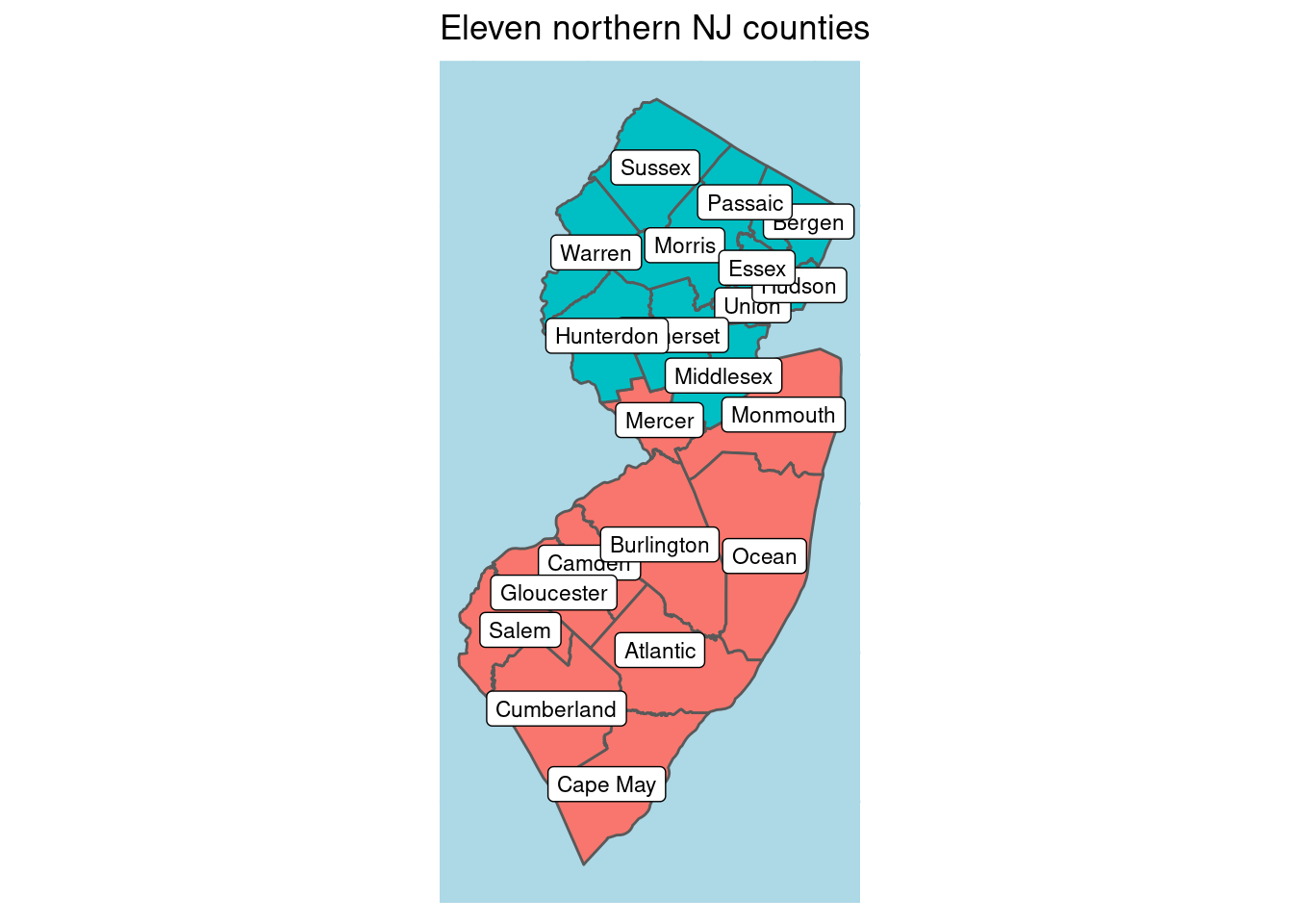 There are other definitions of the North Jersey cultural region. Our definition is on the expansive side, including the three northernmost border counties, Hunterdon, Somerset and Middlesex, and comprises about 62% of the population.
Here is how we construct our new combined table, ct. Note that we mark
officer_years as type tidymodels::importance_weights.
library(tidymodels)
library(njoagleod)
# Build a combined table:
# - Add incident_rate_per_officer (output)
# - Add officer_years (weight)
# - Add northern_nj
# - put all predictors at the end.
ct <- combined_table %>%
  mutate(incident_rate_per_officer = incident_rate_est / officer_count,
         officer_years = importance_weights(officer_count * partial_year)
  ) %>%
  filter(!is.na(incident_rate_per_officer)) %>%
  left_join(municipality, by = "GEOID") %>%
  mutate(northern_nj = case_when(
    county %in% northern_nj_counties ~ TRUE,
    TRUE ~ FALSE
  )) %>%
  select(-county, -municipality) %>%
  relocate(GEOID, incident_rate_per_officer,
           officer_count, incident_count, partial_year, officer_years,
incident_rate_est)| GEOID | incident_rate_per_officer | officer_count | officer_years | officer_mean_age | officer_r_male |
|---|---|---|---|---|---|
| 3402500070 | 0.54 | 41 | 41.0 | 37 | 0.95 |
| 3400100100 | 0.28 | 29 | 29.0 | 38 | 0.93 |
| 3400300700 | 0.20 | 15 | 15.0 | 43 | 0.87 |
| 3402500730 | 0.79 | 9 | 7.6 | 40 | 1.00 |
| 3403701360 | 0.30 | 12 | 9.9 | 38 | 0.92 |
For the purpose of model building, we split this into training and testing sets.
# split into training and testing
set.seed(37)
ct_split <- initial_split(ct, strata = "incident_rate_per_officer", prop = .75)
ct_train <- training(ct_split)
ct_test <- testing(ct_split)
Our training set has 295 rows. 100 rows have been reserved as test data.
A note on our model outcome variable, incident_rate_per_officer
Before we begin building the models, let’s pause a moment to consider our
model output variable, incident_rate_per_officer, which is incident_rate_est divided by officer_count. The value incident_rate_est represents our estimate for the annual rate of use of force incidents per year for each agency.1 We use the per-officer rate rather than the per-resident rate, because incident_rate_est is more strongly correlated with officer_count than population. But is incident_rate_per_officer really independent of officer_count?
In our training data, the two value are correlated, but only at \(p=.11\)
ct_train %>% ggplot(aes(y = incident_rate_per_officer, x = officer_count)) +
  geom_point(aes(alpha = partial_year)) +
  geom_smooth(aes(weight = partial_year), color = "lightyellow") +
  geom_smooth(aes(weight = partial_year), method = "lm", se = FALSE) +
  scale_x_log10() + scale_y_log10() +
  labs(title = "Incident rate not quite independant of officer count",
       subtitle = "(Training data only)") +
  theme(legend.position = "bottom")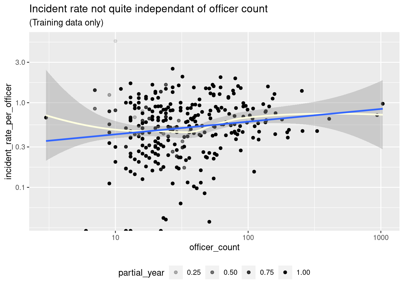
model <- lm(incident_rate_per_officer ~ officer_count,
ct_train, weights=partial_year) %>% tidy()| term | estimate | std.error | statistic | p.value |
|---|---|---|---|---|
| (Intercept) | 0.6130 | 0.0291 | 21.043 | 0.0000 |
| officer_count | 0.0004 | 0.0003 | 1.603 | 0.1101 |
We will proceed as if incident_rate_per_officer is independent of officer_count, but it is something to keep an eye on.
Building the models
As we mentioned above, our approach is:
- First, build a model of
incident_rate_per_officerin terms of the municipal predictors, and excluding the agency predictors. - Next, try to model the residuals of the municipal model with the agency predictors.
Municipal models
Our available predictors are population, density, r_white, r_black,
r_native_american, r_asian, r_pacific_islander, r_other_races, r_two_or_more_races, r_non_hispanic_or_latino, r_hispanic_or_latino,
household_median_income, shore_town and northern_nj.
We will begin with linear models.
Linear municipal model
With a linear model, we will find that the best predictors are household_median_income and northern_nj, along with some combination of the
racial demographics. We get better results when the the race predictors are transformed – we use \(log(1+t)\) here, though \(1/(1+t)\) also works well.
Below, we construct a linear model with r_white, r_black, r_asian and r_other_races. We use the tidymodels idiom for building up our models in
terms of recipes. Our model fit to the training data is fit_lm.
predictors_lm <-
  c(
    "household_median_income",
    "northern_nj",
    "r_white",
    "r_black",
    "r_asian",
    "r_other_races"
  )

mod_lm <- linear_reg()

recipe_lm <- recipe(incident_rate_per_officer ~ ., data = ct_train) %>%
  step_rm(-incident_rate_per_officer,         # Outcome
          -officer_years,                     # Case weights
          -all_of(predictors_lm)) %>%         # Predictors
  step_log(starts_with("r_"), offset = 1)

wf_lm <- workflow() %>%
  add_model(mod_lm) %>%
  add_recipe(recipe_lm) %>%
  add_case_weights(officer_years)

fit_lm <- wf_lm %>%
  fit(data=ct_train)
All of the predictors are significant in this model, but it is worth noting that the adjusted \(R^2\) only reaches \(.325\). (We will not do much better than this in any of our models.)
summary(fit_lm %>% extract_fit_engine())$adj.r.squared## [1] 0.3252659tlm <- fit_lm %>% tidy()| term | estimate | std.error | statistic | p.value |
|---|---|---|---|---|
| (Intercept) | -1.5582053 | 0.7075742 | -2.202179 | 0.0284451 |
| r_white | 3.8557628 | 0.9951361 | 3.874608 | 0.0001323 |
| r_black | 3.6490704 | 0.8851725 | 4.122440 | 0.0000491 |
| r_asian | 2.3164352 | 0.7168403 | 3.231452 | 0.0013745 |
| r_other_races | 2.4075361 | 0.7683446 | 3.133407 | 0.0019060 |
| household_median_income | -0.0000036 | 0.0000009 | -4.227892 | 0.0000317 |
| northern_njTRUE | -0.2622801 | 0.0477574 | -5.491930 | 0.0000001 |
The largest contributions are coming from household_median_income and northern_nj: There are lower rates of use of force in North Jersey and in higher income towns. In this model, the difference between North Jersey and South Jersey is about the same as a difference of $72,000 in household median income.
Interpreting the coefficients of the racial demographic predictors is less straightforward. We will return to them in a subsequent post.
A ‘linear-plus’ model incorporating the Jersey Shore and officer count
The shore_town flag does not appear in our linear model, and adding it does not improve the model. However, recalling the interaction we saw in Part I between shore_town and officer_count – as well as our suspicion about the relationship between officer_count and incident_rate_per_officer – we may be
tempted to add the interaction shore_town * officer_count to our model. Indeed, we do see an improvement, though we get our best model if we remove officer_count. We call this the ‘linear-plus’ model.
predictors_lm_plus <- c(predictors_lm, "shore_town", "shore_officer_count")
recipe_lm_plus <- recipe(incident_rate_per_officer ~ ., data = ct_train) %>%
  step_mutate(shore_officer_count = shore_town * officer_count) %>%
  step_rm(-incident_rate_per_officer,         # Outcome
          -officer_years,                     # Case weights
          -all_of(predictors_lm_plus)) %>%    # Predictors
  step_log(starts_with("r_"), offset = 1)

wf_lm_plus <- wf_lm %>%
  update_recipe(recipe_lm_plus)

fit_lm_plus <- wf_lm_plus %>%
  fit(data = ct_train)

summary(fit_lm_plus %>% extract_fit_engine())$adj.r.squared
## [1] 0.3475749tlm <- fit_lm_plus %>% tidy()| term | estimate | std.error | statistic | p.value |
|---|---|---|---|---|
| (Intercept) | -1.5762062 | 0.7067729 | -2.230145 | 0.0265138 |
| r_white | 3.8774167 | 0.9865117 | 3.930432 | 0.0001064 |
| r_black | 3.7310550 | 0.8804693 | 4.237575 | 0.0000305 |
| r_asian | 2.5261617 | 0.7136784 | 3.539636 | 0.0004675 |
| r_other_races | 2.5385254 | 0.7664448 | 3.312078 | 0.0010451 |
| household_median_income | -0.0000037 | 0.0000009 | -4.347643 | 0.0000192 |
| shore_townTRUE | 0.2359364 | 0.1089613 | 2.165322 | 0.0311897 |
| northern_njTRUE | -0.2925235 | 0.0508569 | -5.751895 | 0.0000000 |
| shore_officer_count | -0.0025703 | 0.0007602 | -3.380982 | 0.0008228 |
In the linear-plus model, lm_plus, the interaction is captured by shore_officer_count, which is just the officer_count when shore_town is TRUE, and is 0 when shore_town is false. So the lm_plus model has dependence on the officer count for shore towns only.
This model has a marginally better \(R^2 = .35\), but at the cost of adding
a predictor, officer_count, that we did not want to add.
Cross validation
Let’s check the robustness of our models by using cross validation.
#### CV of linear models
set.seed(37)
folds <- vfold_cv(ct_train, v = 10, repeats = 5)
metrics_lm <- wf_lm %>%
  fit_resamples(folds) %>%
  collect_metrics()
metrics_lm_plus <- wf_lm_plus %>%
  fit_resamples(folds) %>%
  collect_metrics()

mt <- lst(metrics_lm, metrics_lm_plus) %>%
  bind_rows(.id = "model") %>%
  mutate(model = str_sub(model, 9)) %>%
select(-.config)| model | .metric | .estimator | mean | n | std_err |
|---|---|---|---|---|---|
| lm | rmse | standard | 0.424 | 50 | 0.026 |
| lm | rsq | standard | 0.254 | 50 | 0.019 |
| lm_plus | rmse | standard | 0.436 | 50 | 0.026 |
| lm_plus | rsq | standard | 0.233 | 50 | 0.019 |
We observe that on cross validated data, the linear model slightly beats the linear-plus model on both RMSE (.424 vs .436) and \(R^2\) (.254 vs .233). The advantage the linear-plus model showed before we did cross validation was probably
a bit of overfitting. For now, we will take lm as our best model.
Problems with the linear municipal models
One obvious problem with the linear models is that they may predict negative incident rates. In fact, we do have one negative prediction in the training data.
fit_lm %>%
extract_fit_engine() %>%
augment(ct_train) %>%
ggplot(aes(x = .fitted, y = incident_rate_per_officer)) +
geom_point(aes(size = officer_count, alpha = partial_year)) +
geom_abline(color = "red") +
ylim(0, 2.5) +
theme(legend.position = "bottom") +
labs(title = "Linear model fit",
subtitle = "(Training data only)")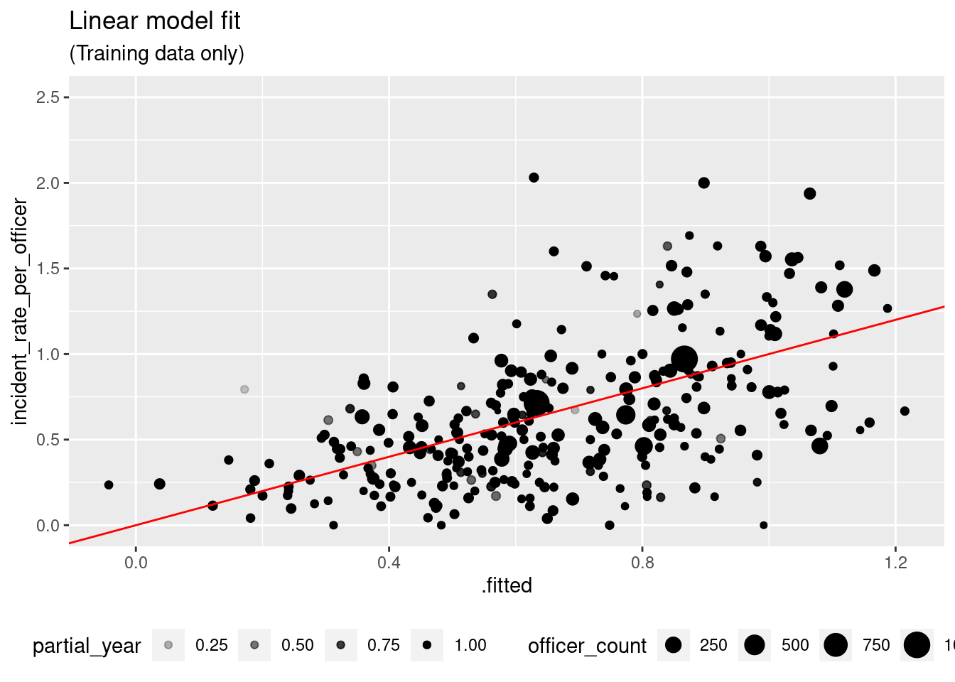 A second problem is that the model may be under-predicting the higher rates, though it is hard to say from this graph because of theheteroskedasticity:
par(mfrow = c(1, 2))
plot(fit_lm %>% extract_fit_engine(), which = c(1, 3))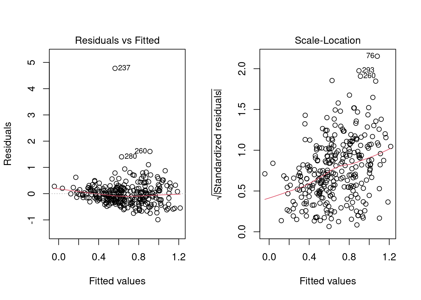
Log-linear municipal model
We will try to address the linear model problems with a log-linear model, \(\log y = \alpha + \sum\beta_ix_i + \epsilon\).
# Log-linear model
mod_llm <- linear_reg() %>%
  set_engine("glm", family = Gamma("log"))
We can reuse our linear model recipe, except that we will have to filter out the rows with no incidents. We note that we can expect this to cause a bias away from zero for small departments.
recipe_llm <- recipe_lm %>%
  step_filter(incident_rate_per_officer > 0)
wf_llm <- wf_lm %>%
  update_model(mod_llm) %>%
  update_recipe(recipe_llm)
fit_llm <- wf_llm %>%
  fit(ct_train)
We do not have negative predictions or heteroskedasticity with the log-linear model.
fit_llm %>%
  extract_fit_engine() %>%
  augment(ct_train %>% filter(incident_rate_per_officer > 0),
          type.predict = "response") %>%
  ggplot(aes(x = .fitted, y = incident_rate_per_officer)) +
  geom_point(aes(size = officer_count, alpha = partial_year)) +
  geom_abline(color = "red") +
  ylim(0, 2.5) + xlim(0, 1.5) +
  theme(legend.position = "bottom") +
  labs(title = "Log-Linear model fit",
       subtitle = "(Training data only)")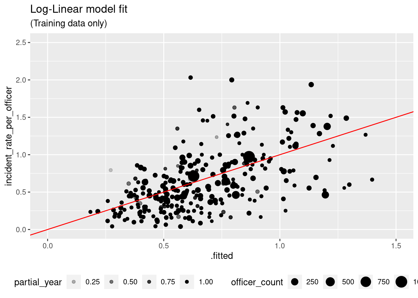
par(mfrow = c(1, 2))
plot(fit_llm %>% extract_fit_engine(), which=c(1, 3))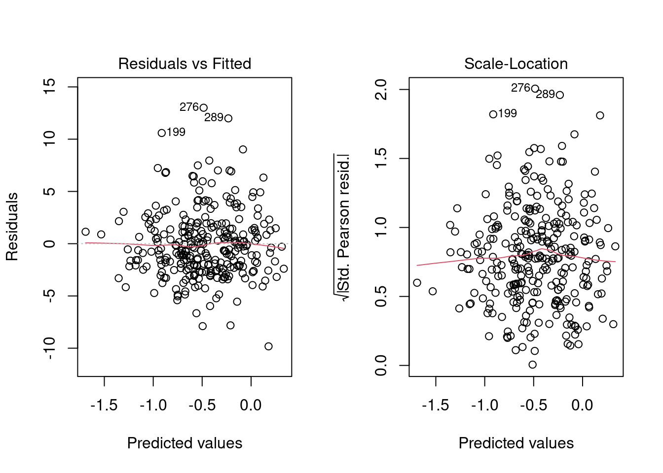
Let’s also try a log-linear-plus variant, similar to linear-plus:
recipe_llm_plus <- recipe_lm_plus %>%
  step_filter(incident_rate_per_officer > 0)
wf_llm_plus <- wf_llm %>%
  update_recipe(recipe_llm_plus)
fit_llm_plus <- wf_llm_plus %>%
  fit(ct_train)
Cross validation
Let’s get cross validation metrics for the two log-linear models and compare to the linear models.
metrics_llm <- wf_llm %>%
  fit_resamples(folds) %>%
  collect_metrics()
metrics_llm_plus <- wf_llm_plus %>%
  fit_resamples(folds) %>%
  collect_metrics()
mt <- lst(metrics_lm, metrics_llm, metrics_lm_plus, metrics_llm_plus) %>%
  bind_rows(.id = "model") %>%
  mutate(model = str_sub(model, 9)) %>%
select(-.config)| model | .metric | .estimator | mean | n | std_err |
|---|---|---|---|---|---|
| lm | rmse | standard | 0.424 | 50 | 0.026 |
| lm | rsq | standard | 0.254 | 50 | 0.019 |
| llm | rmse | standard | 0.424 | 50 | 0.026 |
| llm | rsq | standard | 0.258 | 50 | 0.020 |
| lm_plus | rmse | standard | 0.436 | 50 | 0.026 |
| lm_plus | rsq | standard | 0.233 | 50 | 0.019 |
| llm_plus | rmse | standard | 0.438 | 50 | 0.026 |
| llm_plus | rsq | standard | 0.238 | 50 | 0.021 |
The differences here are very slight, but the log-linear model llm performs at least as well as the linear model lm, while adding some desirable features (no negative predictions, homoskedasticity). The lm_plus and llm_plus are not adding anything that would justify the compromise we made in constructing them (adding shore_officer_count).
So our best model so far is the log-linear model llm.
ML municipal model
Before turning to the agency predictors, let’s see if machine learning algorithms can turn up any patterns that our linear models are missing.
We are not interested in replacing our interpretable linear model with an opaque ML model that performs only marginally better, so we will not spend a huge amount of time here tuning. We will use the xgboost package to build our model.2
We will begin by constructing a recipe for xgboost. We let xgboost use all the
municipal predictors except r_pacific_islander and r_native_american, which are usually very close to zero.
counts <- ct_train %>%
count(r_native_american > 0.01, r_pacific_islander > 0.005)| r_native_american > 0.01 | r_pacific_islander > 0.005 | n |
|---|---|---|
| FALSE | FALSE | 288 |
| TRUE | FALSE | 7 |
We will do the same log transform of the r_ fields as we did in our linear models. Note we have to convert the logical columns (shore_town and northern_nj) to integers.
municipal_predictors <- ct %>% select(population:northern_nj) %>% names()
recipe_xgb <- recipe(incident_rate_per_officer ~ ., data = ct_train) %>%
  step_rm(-incident_rate_per_officer, -officer_years,
          -all_of(municipal_predictors)) %>%
  step_rm(r_pacific_islander, r_native_american) %>%
  step_log(starts_with("r_"), offset = 1) %>%
  step_integer(northern_nj, shore_town)
Here is the best tune we found for this recipe:
# XGBoost model with tuned parameters
mod_xgb <- boost_tree(
  mtry = .48,
  trees = 600,            # nrounds
  min_n = 24,             # min_child_weight
  tree_depth = 2,         # max_depth
  learn_rate = .0185,     # eta
  loss_reduction = .001,  # gamma
  sample_size = .715,
  stop_iter = 50          # early_stopping_rounds
) %>%
  set_engine("xgboost",
             alpha = .1,
             lambda = 17500,
             nthread = 12,
             counts = FALSE) %>%
  set_mode("regression")
# XGBoost workflow
wf_xgb <- workflow() %>%
  add_model(mod_xgb) %>%
  add_recipe(recipe_xgb) %>%
  add_case_weights(officer_years)
Comparison with log-linear model
If we look at the cross validation metrics and compare the XGBoost model to our existing models, we see that we have a small but noticeable improvement in both \(R^2\) and RMSE.
metrics_xgb <- wf_xgb %>%
  fit_resamples(folds) %>%
  collect_metrics()
mt <- lst(metrics_lm,
    metrics_llm,
    metrics_lm_plus,
    metrics_llm_plus,
    metrics_xgb) %>%
  bind_rows(.id = "model") %>%
  mutate(model = str_sub(model, 9)) %>%
select(-.config)| model | .metric | .estimator | mean | n | std_err |
|---|---|---|---|---|---|
| lm | rmse | standard | 0.424 | 50 | 0.026 |
| lm | rsq | standard | 0.254 | 50 | 0.019 |
| llm | rmse | standard | 0.424 | 50 | 0.026 |
| llm | rsq | standard | 0.258 | 50 | 0.020 |
| lm_plus | rmse | standard | 0.436 | 50 | 0.026 |
| lm_plus | rsq | standard | 0.233 | 50 | 0.019 |
| llm_plus | rmse | standard | 0.438 | 50 | 0.026 |
| llm_plus | rsq | standard | 0.238 | 50 | 0.021 |
| xgb | rmse | standard | 0.418 | 50 | 0.025 |
| xgb | rsq | standard | 0.278 | 50 | 0.019 |
Next, let’s compare the shape of the predictions generated by the log-linear and ML models:
fit_xgb <- wf_xgb %>%
  fit(ct_train)
ct_train_aug <- bind_cols(
  ct_train,
  fit_llm %>% predict(ct_train) %>% rename(llm.pred = .pred),
  fit_xgb %>% predict(ct_train) %>% rename(xgb.pred = .pred)
)
ct_train_aug %>%
  pivot_longer(llm.pred:xgb.pred, names_to = "model", values_to = "pred") %>%
  ggplot(aes(x = incident_rate_per_officer, y = pred)) +
  geom_point(aes(size = officer_count, alpha = partial_year)) +
  geom_abline() +
  xlim(0,2.1) +
  facet_wrap("model") +
  labs(title = "Log-linear and XGBoost predictions by incident rate",
        subtitle = "(Training data only)")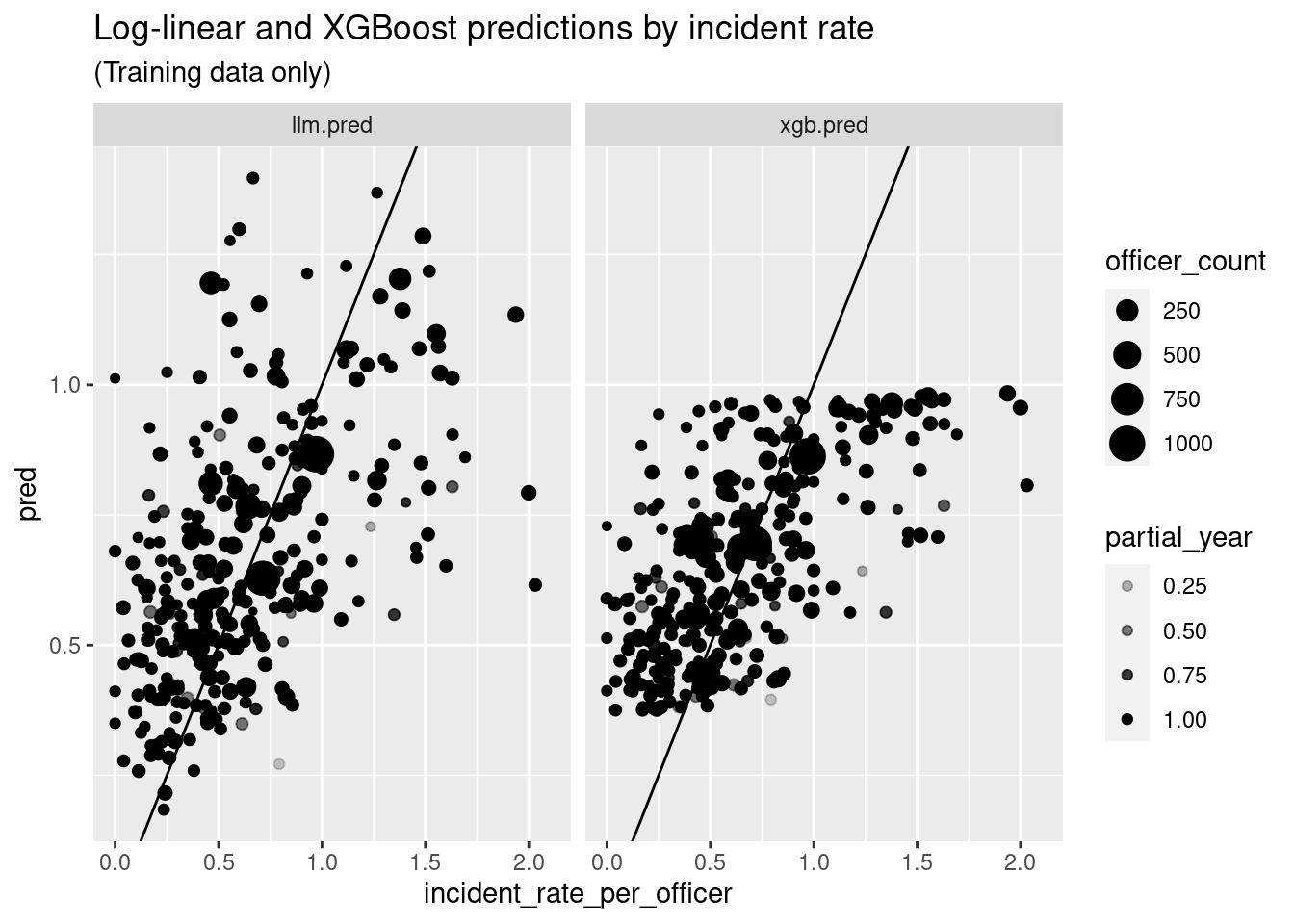
ct_train_aug %>%
ggplot(aes(y = llm.pred, x = xgb.pred)) +
geom_point(aes(size = officer_count, alpha = partial_year)) +
geom_abline() +
xlim(.3, 1) +
labs(title = "Log-linear predictions by XGBoost predictions",
subtitle = "(Training data only)")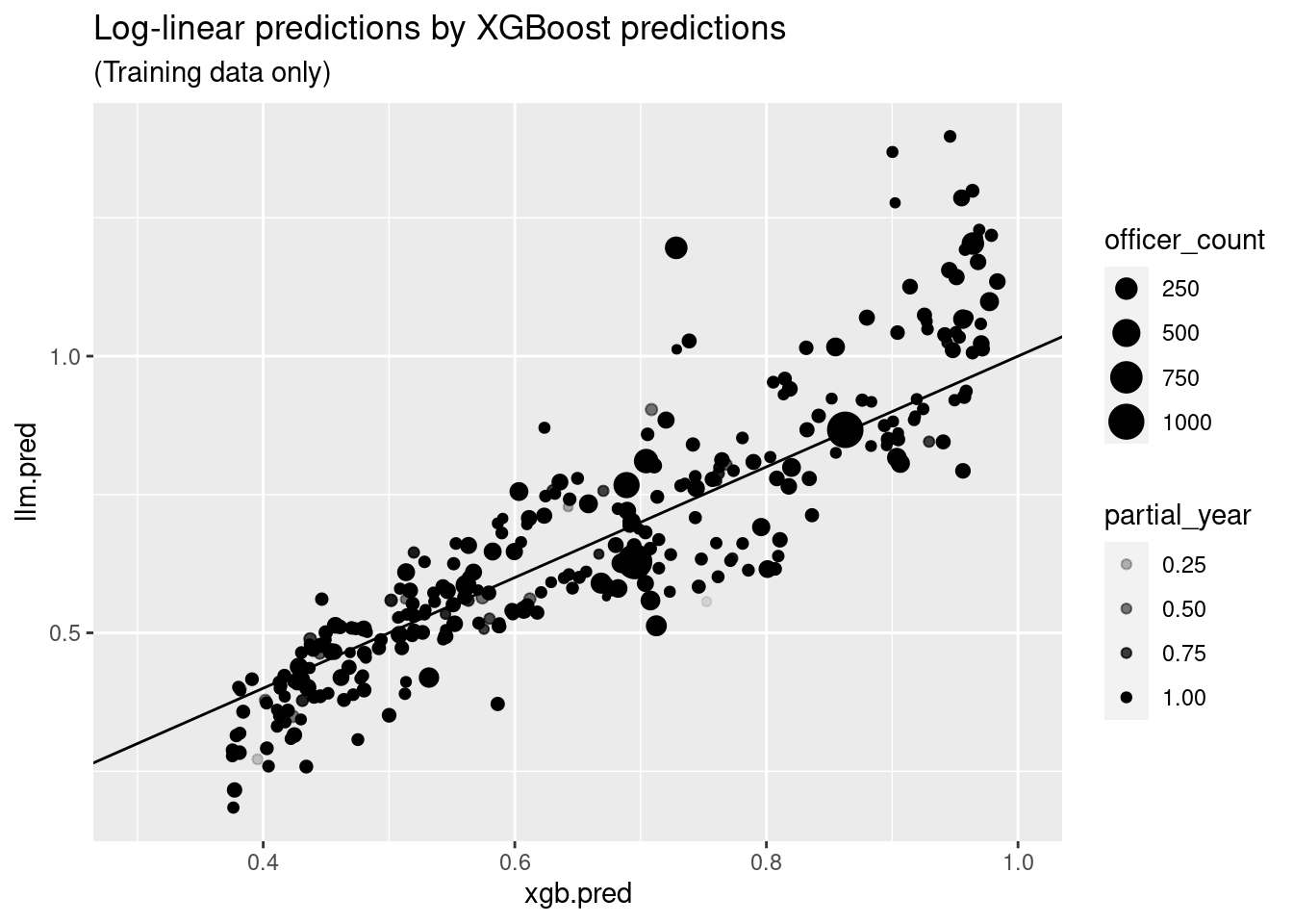 Here we see that that the ML model is far more conservative than the log linear
model, never making predictions outside of the band \([.35,1]\), though the two models are pretty tightly correlated.
Next, let’s find out what the XGBoost model is seeing that the linear models are missing, by first taking a look at variable importance.
library(vip)
library(gridExtra)
grid.arrange(
vip(fit_llm %>% extract_fit_engine()) +
labs(title = "Log-linear model vip"),
vip(fit_xgb %>% extract_fit_engine()) +
labs(title = "XGBoost model vip"),
ncol = 2
)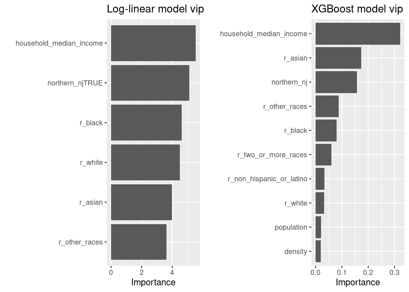 The ML model didn’t find much use for the variables omitted from our linear models, but it does rate
 r_asian more highly. Let’s see if we can find out where fit_xgb is making better predictions than fit_llm by breaking the training
set down by the top three variables, r_asian, household_median_income, and northern_nj:
tbl <- ct_train_aug %>%
  mutate(region = if_else(northern_nj, "NORTH", "SOUTH"),
         income = if_else(household_median_income < 89000, "LOW", "HIGH"),
         r_asian = case_when(
           r_asian < .023 ~ "LOW",
           r_asian < .064 ~ "MEDIUM",
           TRUE ~ "HIGH"
         )) %>%
  group_by(r_asian, region, income) %>%
  summarize(count = n(),
            rate.mean = weighted.mean(incident_rate_per_officer,
                                      as.double(officer_years)),
            llm.mean = weighted.mean(abs(llm.pred),
                                     as.double(officer_years)),
            xgb.mean = weighted.mean(abs(xgb.pred),
                                     as.double(officer_years)),
            llm.mae = weighted.mean(abs(llm.pred-incident_rate_per_officer),
                                    as.double(officer_years)),
            xgb.mae = weighted.mean(abs(xgb.pred-incident_rate_per_officer),
                                    as.double(officer_years)),
            .groups="drop"
  ) %>%
arrange(xgb.mae - llm.mae)| r_asian | region | income | count | rate.mean | llm.mean | xgb.mean | llm.mae | xgb.mae |
|---|---|---|---|---|---|---|---|---|
| HIGH | SOUTH | LOW | 5 | 0.540 | 1.089 | 0.745 | 0.549 | 0.228 |
| MEDIUM | SOUTH | HIGH | 11 | 0.441 | 0.674 | 0.608 | 0.245 | 0.179 |
| MEDIUM | NORTH | LOW | 26 | 0.706 | 0.677 | 0.723 | 0.207 | 0.170 |
| HIGH | NORTH | LOW | 27 | 0.593 | 0.632 | 0.644 | 0.188 | 0.157 |
| LOW | SOUTH | HIGH | 23 | 0.686 | 0.635 | 0.616 | 0.357 | 0.331 |
| MEDIUM | SOUTH | LOW | 21 | 1.053 | 0.991 | 0.903 | 0.321 | 0.296 |
| HIGH | NORTH | HIGH | 55 | 0.476 | 0.455 | 0.475 | 0.163 | 0.163 |
| MEDIUM | NORTH | HIGH | 35 | 0.455 | 0.452 | 0.510 | 0.172 | 0.174 |
| HIGH | SOUTH | HIGH | 14 | 0.692 | 0.694 | 0.614 | 0.272 | 0.274 |
| LOW | NORTH | LOW | 13 | 0.768 | 0.770 | 0.798 | 0.173 | 0.190 |
| LOW | NORTH | HIGH | 10 | 0.354 | 0.474 | 0.518 | 0.173 | 0.204 |
| LOW | SOUTH | LOW | 55 | 1.123 | 1.008 | 0.912 | 0.345 | 0.387 |
labeller = as_labeller(
  c("LOW" = "Low Asian density", "MEDIUM" = "Medium Asian density",
    "HIGH" = "High Asian density",
    "NORTH" = "North Jersey", "SOUTH" = "South Jersey")
)
ct_train_aug %>%
  mutate(region = if_else(northern_nj, "NORTH", "SOUTH"),
         r_asian = factor(case_when(
           r_asian < .023 ~ "LOW",
           r_asian < .064 ~ "MEDIUM",
           TRUE ~ "HIGH"
         )),
         r_asian = fct_relevel(r_asian, "LOW", "MEDIUM", "HIGH"),
         xgb_v_llm =
           abs(xgb.pred - incident_rate_per_officer) -
           abs(llm.pred - incident_rate_per_officer)) %>%
  ggplot(aes(x = household_median_income, y = incident_rate_per_officer,
             color = xgb_v_llm)) +
  geom_point(aes(size = officer_count, alpha = partial_year)) +
  geom_smooth(aes(weight = as.double(officer_years)), method = "lm", se = FALSE,
              color = "grey") +
  annotate("rect", xmin = 0, xmax = 250000, ymin = .37, ymax = 1,
           alpha = .1, fill = "green") +
  scale_color_gradient2(low = "red", mid = "white", high = "blue",
                        limits = c(-.3, .3), oob = squish) +
  scale_x_continuous(labels = label_number(suffix = "K", scale = .001)) +
  ylim(0, 2.2) +
  facet_grid(rows = vars(region), cols = vars(r_asian), labeller = labeller) +
  theme(legend.position = "none") +
  labs(title = "Model performance by Asian population density, region and income",
       subtitle = "Red = ML model better, Blue = Log-linear model better")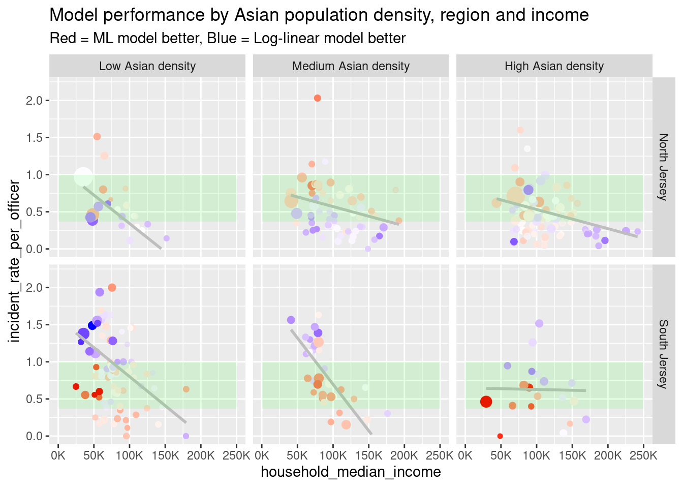
(The green bar represents the prediction range for the ML model)
General conclusions that we can draw from this table and graph:
- Household income becomes less important as the Asian population density increases.
- The log-linear model performs best relative to the ML model when the Asian population density is low.
- The log-linear model does better with high incident rates in South Jersey and low rates in North Jersey.
- Conversely, the ML model does better with low incident rates rates in South Jersey and high incident rates in North Jersey.
The South Jersey, low-income, low-Asian-density sector is particularly interesting:
- It has the highest mean rate of use of force per officer (1.12).
- It has the highest mean prediction for both ML (1.008) and log-linear models (.912).
- It is where the log-linear model (.345 MAE) has its best performance relative to ML model (.387 MAE).
- It has the highest MAE for the ML model in an absolute sense.
- It contains 6 of the 10 cases where the ML model outperforms the log-linear model.
- It contains 6 of the 10 cases where the log-linear model outperforms the ML model.
We could plausibly gain a marginal improvement in the linear models by adding some interaction terms between these three variables, but we will not pursue this here.
Agency models
Let us now see what can be gained by considering the agency predictors. Our approach will be to take the residuals from the log-linear model from the previous section, and try to build a model for the residuals in terms of the agency predictors.
Linear agency models
Let’s start very simply with a linear model. First we set up the table with the residuals added.
ct_train_agcy <-
  bind_cols(
    ct_train,
    wf_llm %>% fit(ct_train) %>% predict(ct_train) %>% rename(llm.pred = .pred),
  ) %>%
  mutate(llm.resid = incident_rate_per_officer - llm.pred)
Now we set up a linear model of the residual in terms of the agency predictors.
mod_agcy_lm <- linear_reg()
agency_predictors <- ct_train_agcy %>%
  select(officer_mean_age:officer_r_race_na) %>% names()
recipe_agcy_lm <- recipe(llm.resid ~ ., data = ct_train_agcy) %>%
  step_rm(-llm.resid,                         # Outcome
          -officer_years,                     # Case weights
          -all_of(agency_predictors))         # Predictors

wf_agcy_lm <- workflow() %>%
  add_model(mod_agcy_lm) %>%
  add_recipe(recipe_agcy_lm) %>%
  add_case_weights(officer_years)

fit_agcy_lm <- wf_agcy_lm %>%
  fit(ct_train_agcy)

tbl <- fit_agcy_lm %>% tidy()| term | estimate | std.error | statistic | p.value |
|---|---|---|---|---|
| (Intercept) | 0.621 | 0.536 | 1.158 | 0.248 |
| officer_mean_age | -0.006 | 0.011 | -0.534 | 0.594 |
| officer_r_male | 0.043 | 0.308 | 0.139 | 0.889 |
| officer_r_white | -0.442 | 0.387 | -1.142 | 0.254 |
| officer_r_black | -0.471 | 0.357 | -1.319 | 0.188 |
| officer_r_asian | -1.922 | 0.871 | -2.207 | 0.028 |
| officer_r_hispanic_or_latino | -0.316 | 0.372 | -0.849 | 0.396 |
| officer_r_race_other | 0.199 | 1.238 | 0.160 | 0.873 |
| officer_r_race_na | NA | NA | NA | NA |
The model is not promising. It has \(p=.423\) and adjusted \(R^2=.0003\). Log-transforming the officer_r_ fields, as we did for the r_ fields in the municipal models, does not turn out to be helpful. If we iteratively remove the worst predictor and refit, we arrive at our best linear model, which has a single predictor, officer_r_asian.
recipe_agcy_lm_asian <- recipe(llm.resid ~ officer_r_asian + officer_years,
                               data = ct_train_agcy)
wf_agcy_lm_asian <- wf_agcy_lm %>%
  update_recipe(recipe_agcy_lm_asian)
fit_agcy_lm_asian <- wf_agcy_lm_asian %>%
  fit(ct_train_agcy)
tbl <- fit_agcy_lm_asian %>% tidy()| term | estimate | std.error | statistic | p.value |
|---|---|---|---|---|
| (Intercept) | 0.019 | 0.022 | 0.872 | 0.384 |
| officer_r_asian | -1.433 | 0.793 | -1.807 | 0.072 |
This is not a very strong model, but on cross validation it looks worse, as it is beaten by the empty model (RMSE .418 vs .417 for the empty model). Visually, it is hard to see how the model could be much improved by non-linear terms without overfitting.
ct_train_agcy %>%
ggplot(aes(x = officer_r_asian, y = llm.resid)) +
geom_point(aes(size = officer_count, alpha = partial_year)) +
geom_smooth(aes(weight = as.double(officer_years)), color = "lightyellow") +
scale_x_log10() +
theme(legend.position = "bottom") +
ylim(-1, 1.8) +
labs(title = "Log Linear residuals by officer_r_asian",
subtitle = "(Training data only)")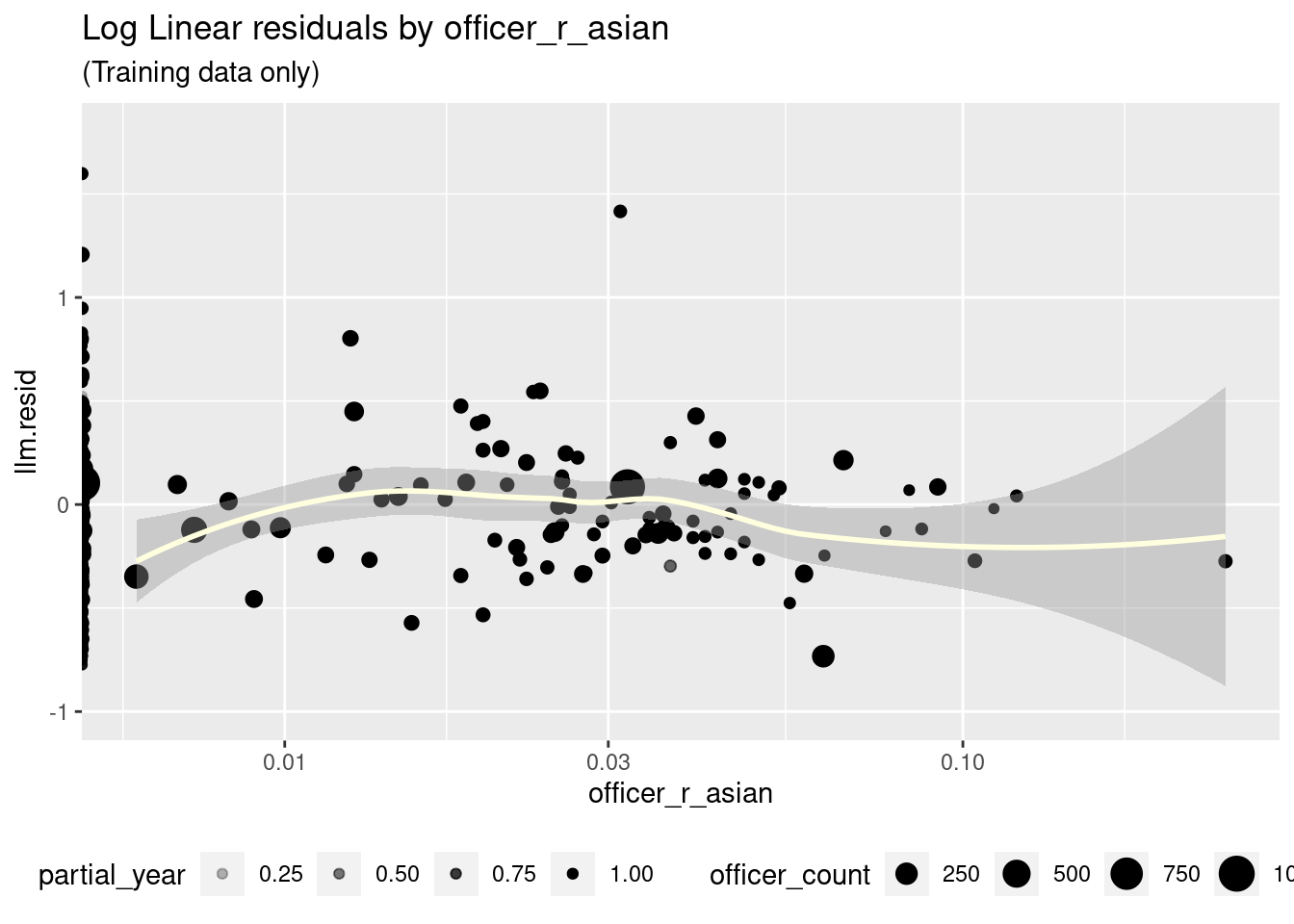 Let’s now see if we can find an ML algorithm that will turn up anything that we missed.
ML agency models
We will use XGBoost again. Here is our model and best tune:
recipe_agcy_xgb <-
  recipe(llm.resid ~ ., data = ct_train_agcy) %>%
  step_rm(GEOID:partial_year, incident_rate_est, population:llm.pred)

mod_agcy_xgb <- boost_tree(
  trees = 3000,           # nrounds
  min_n = 14,             # min_child_weight
  tree_depth = 11,        # max_depth
  learn_rate = .008,      # eta
  loss_reduction = 44,    # gamma
  sample_size = 1,
  stop_iter = 50          # early_stopping_rounds
) %>%
  set_engine("xgboost",
             alpha = .003,
             lambda = .003,
             colsample_bytree = 1,
             nthread = 12,
             counts = FALSE) %>%
  set_mode("regression")

wf_agcy_xgb <- workflow() %>%
  add_model(mod_agcy_xgb) %>%
  add_recipe(recipe_agcy_xgb) %>%
  add_case_weights(officer_years)
Unfortunately this model barely outperforms the empty model (RMSE .416 vs .417 for the empty model, \(R^2\) = .03). The top variables in this model are officer_r_asian, which we examined when evaluating linear models, and officer_mean_age.
fit_agcy_xgb <- wf_agcy_xgb %>%
fit(ct_train_agcy)
fit_agcy_xgb %>%
extract_fit_engine() %>% vip()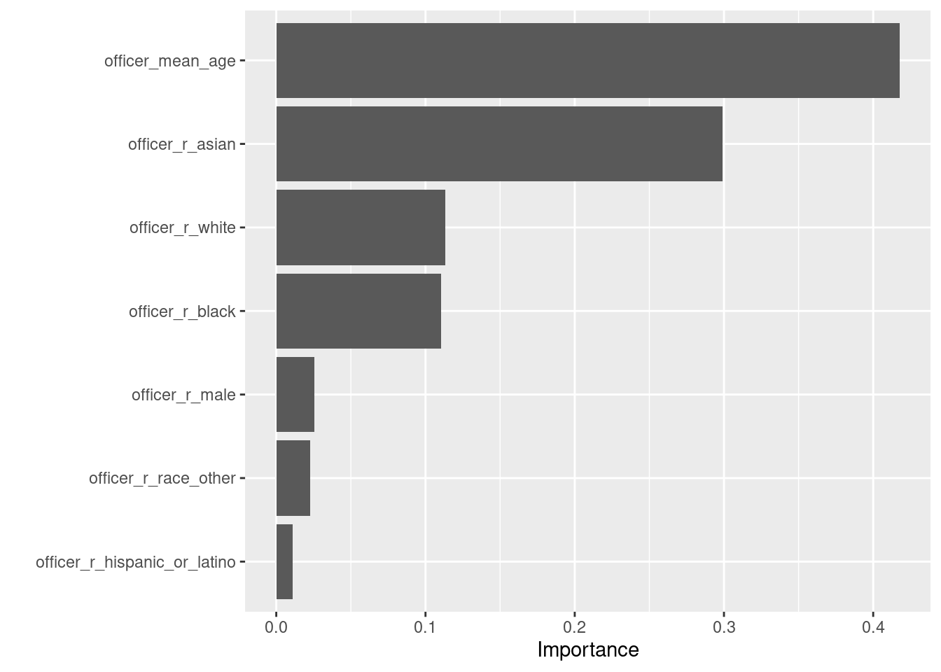 Here is now
 fit_agcy_xgb uses officer_mean_age.
augment(fit_agcy_xgb, ct_train_agcy) %>%
pivot_longer(c(".pred", "llm.resid"),
names_to = "residual_type",
values_to = "residual") %>%
ggplot(aes(x = officer_mean_age, y = residual, color = residual_type)) +
geom_point() +
scale_color_hue(labels = c("Predicted", "Actual")) +
ylim(-1.1, 2) +
guides(color = guide_legend(title = "Residual Type")) +
theme(legend.position = "bottom") +
labs(title = "ML model predictions vs officer_mean_age")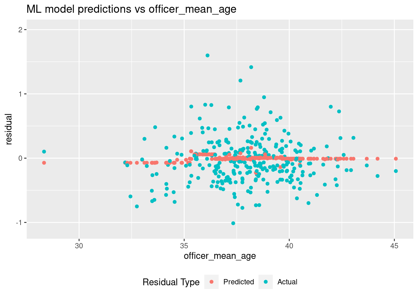 Possibly there is something going on with younger agencies, but the prediction
spike in the narrow band around age 36 appears to be an overfit driven
by a few extreme values.
In any case, the ML model is barely distinguishable from the empty model.
Final fit
Having selected the log-linear model, let’s perform a final fit and see how it performs against the test data.
last_fit_llm <- wf_llm %>%
  last_fit(ct_split)
tbl <- last_fit_llm %>%
collect_metrics()| .metric | .estimator | .estimate | .config |
|---|---|---|---|
| rmse | standard | 0.395 | Preprocessor1_Model1 |
| rsq | standard | 0.217 | Preprocessor1_Model1 |
The RMSE (.395) is a little better than the cross validated RMSE on the training set, but the \(R^2\) (.217) is a bit worse.
Conclusions
- Using a log-linear model of the use-of-force rate for municipal agencies, we can account for a bit above 20% of the variance in terms of household median income, several racial demographic factors, and a North Jersey regional flag.
- After accounting for the municipal factors with the log-linear model, essentially no additional variance can be explained by agency diversity factors.
Next
In the next post, we will look at outliers and interpretations of the log-linear municipal model.
Based on 2021 use of force incidents. For departments with a full year of data,
incident_rate_estis justincident_count. For agencies with only a partial year of data, we divide bypartial_year, which is itself an estimate. See Part II for details.↩︎Before settling on xgboost, we used h2o AutoML to do an initial search. The top performing models tended to be GBMs or stacked models. They did not perform as well as our best xgboost tune.↩︎